Creating charts
You can aggregate an app's record data (e.g., numeric values, a number of records) and create a chart from the data. If you save your chart settings, you can use them any time to display a chart with the latest data on the app's main page (the View screen).
To save chart settings, you need to have app management permission.
In kintone, you can perform data aggregation in either of the ways described below and turn the data into a chart or table.
- Design a graph starting from graph type
Create a chart or table by specifying a chart type and aggregation conditions. - Use a recommended graph
Chart/table suggestions are automatically generated based on your app data.
Create a chart or table by selecting the suggestion that meets your needs.
For details on the different types of charts and how they can be used, refer to the following page.
Chart types and their usage
Steps
This section describes the steps to create a chart from the View screen.
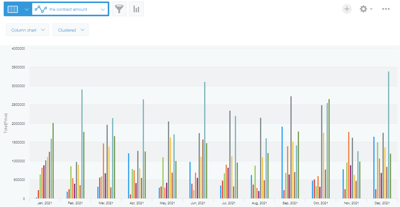
Here, we'll create a chart that displays the monthly sales amount for the year using the "Received Order (Real-time)" app, which is used for managing order dates and amounts. To create the chart, we'll select a type displayed under Design a graph starting from graph type.
Example of a created chart

-
On an app's View screen, click the Create graph icon.
-
Select an option displayed under Design a graph starting from graph type.
In this example, we'll select Column chart.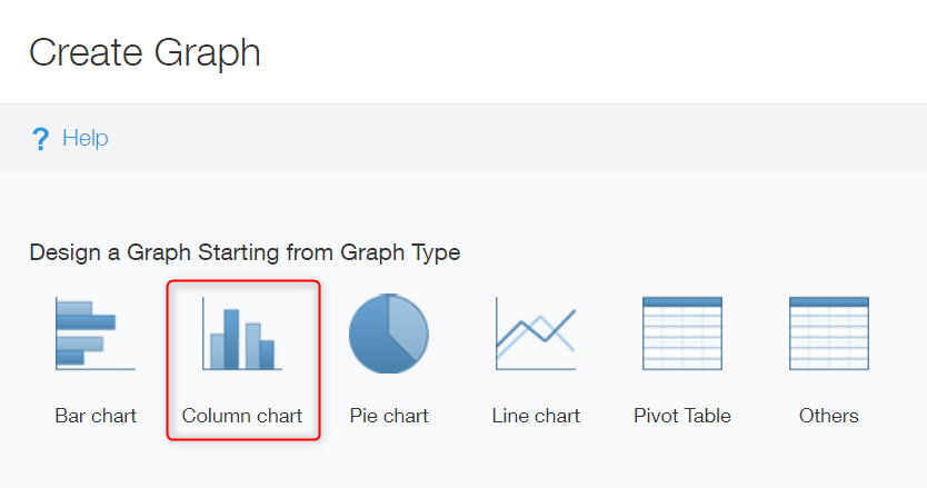 Reference: Chart types and their usage
 -
In the Chart type section, select how to display your aggregated data.
In this example, we'll select Clustered.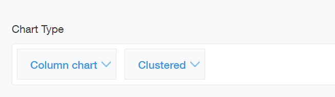
-
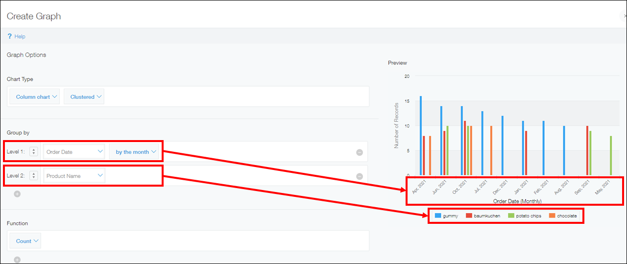
In the Group by section, configure the grouping used for the chart.
In this section, you can configure up to three item levels: Level 1, Level 2, and Level 3. The fields for Level 2 and Level 3 items appear when you click the plus sign-shaped Add icon at the bottom of the Group by section.
Since we want monthly sales data to be aggregated, we'll specify "Order Date" and "by the month" for Level 1 and "Product Name" for Level 2.
If you configure Level 1 and Level 2 items for a column chart, the Level 1 item will be displayed on the horizontal axis and the Level 2 item will be used as data series. You can check the preview of the chart on the screen.
-
In the Function section, select one or more functions to specify how you want the data to be aggregated.
You can select functions from the options Count, Sum, Average, Maximum, and Minimum.
Since we want to calculate the total sales amount, we'll select Sum for the function and Price for the field whose values are to be aggregated.
In the case of a clustered column chart, the selected function is applied to the vertical axis.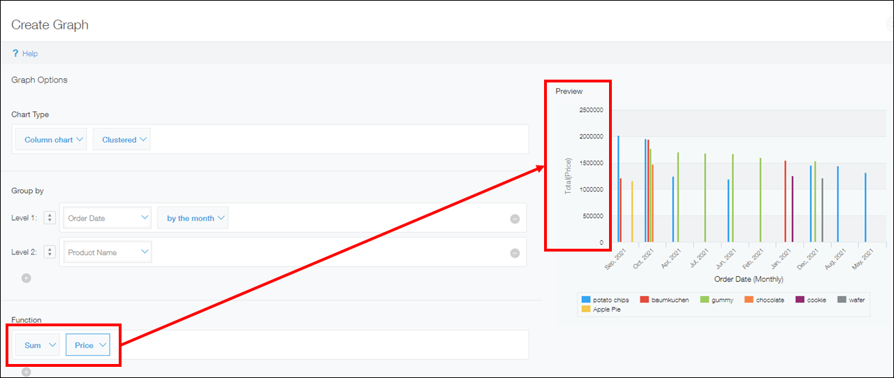
-
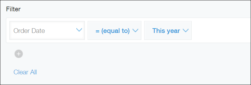
Configure the settings in the Filter section.
You can set filter conditions to narrow down the records included in the aggregation—for example, when specifying a date range. You can click Clear all to clear all of the conditions that have already been added.
Since we want the sales amount for this year to be aggregated, we'll select "Order Date", = (equal to), and This year.
-
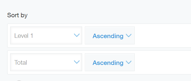
In the Sort by section, configure the ordering of the aggregate result.
You can select the items used for sorting from the options Total, Level 1, Level 2, and Level 3.- If you select Total: The data in the chart is sorted based on the aggregation results according to the settings configured in the Function section in Step 5. You can choose either Ascending or Descending order for sorting.
- If you select Level 1, Level 2, or Level 3: The data in the chart is sorted based on the values of the field specified in the Group by section in Step 4. You can choose either Ascending or Descending order for sorting.
In this example, we'll select Ascending for both Level 1 and Total.
-
Click Save as new graph or Apply.
-
If you clicked Save as new graph in Step 8, name the chart and save it. After doing so, the chart you created will be displayed.
If you click Apply, the chart you created will be displayed.
You have successfully created a chart that shows aggregate results.
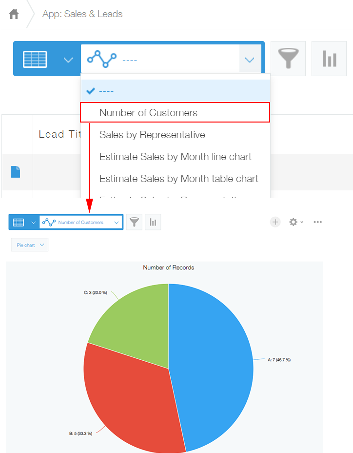
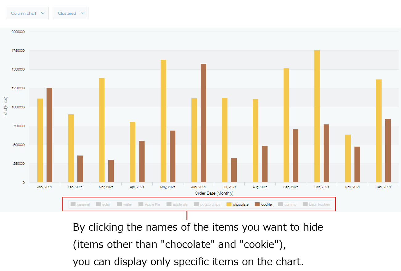
Changing display items
By clicking the item names (data series) on a chart, you can change whether to show/hide individual items.
This is useful when you want to compare specific items on a chart to further analyze the displayed result.
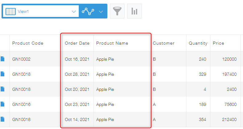
Displaying filtered records from a chart
By clicking an individual aggregate result, you can display a list of records included in the result.
This is useful when you want to check which record data has been aggregated.
For example, say you click the bar in a chart that represents the sales data for "Apple Pie" in October.
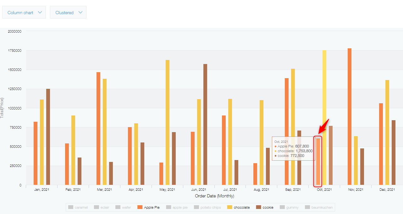
Doing so displays a list of only records that meet the criteria (October, "Apple Pie").
The fields displayed in the list and their ordering are the same as those in the default view (the view placed at the top of the view list on the Views tab of the App settings screen).
Reference: Changing the default view